Patterns & Data 2: Patterns & Data Unplugged
< Back to Building BlockHow can you find meaning in data? You need to be able to identify patterns in that data! Observing patterns allows you to see when something goes as planned or behaves unexpectedly. Depending on how data is presented can impact how easy it is to find those patterns and bring meaning to them.
This table and graph show the same dataset: US unemployment claims*. While studying the data, consider the two questions below:
*Please note that the table only shows a snippet of the dataset due to the size of the table. The rest of the table can be seen at this link after you click “submit”*
☞ Which is easier to understand?
☞ Which is more compact?
☞ Which has more detail?
Most people would agree that the graph in the previous step is easier to understand than the spreadsheet because it displays the data visually. You can easily see when initial unemployment claims increased and decreased.
The graph is also more compact, since it fits all the contents of the table into one page, whereas the table spans many pages.
However, the table has more detail, since we can see the exact number of claims, unlike the graph which just gives us a rough estimate.
Reflection
Consider data you collect in your daily life or in your classroom. Do you often go back and forth between tables and graphs depending on the data you are collecting? Why?
Let’s return to the graph. The large spike towards the end of the graph may have caught your eye since it breaks the pattern. But let’s consider the recognizable pattern you can see in the previous decades:
☞ Why are there so many small spikes of increased claims in short periods of time?
☞ What do they represent?
☞ When do they happen?
It turns out that small, predictable spikes that occur every year are the result of seasonal unemployment.
According to the Bureau of Labor Statistics
"Over the course of a year, the size of the labor force, the levels of employment and unemployment, and other measures of labor market activity undergo fluctuations due to seasonal events including changes in weather, harvests, major holidays, and school schedules. Because these seasonal events follow a more or less regular pattern each year, their influence on statistical trends can be eliminated by seasonally adjusting the statistics from month to month."
So when adjusting for seasonal unemployment, you can create a graph that more accurately portrays the trends of unemployment over years.
Graphs aren’t just pretty pictures. Sometimes data that seem similar can actually be different. Using a graph can help you spot those differences.
A common way of describing data is by creating a trendline. A trendline is a line that roughly describes the relationship between two variables. In order to place an accurate trendline on a graph, you must consider the patterns you are observing.
In the data sets above, the same algorithm was used to draw a trendline. Each dataset has the same trendline even though the data looks very different!
If you want to more accurately show the trend in each of these four data sets, what line or curve should you draw?
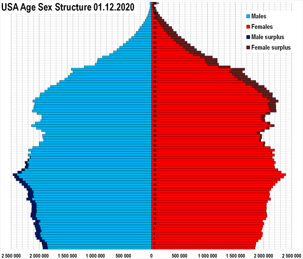
For this step, look at the population pyramids of different countries, using this Wikipedia list. In most browsers, you should be able to hover over the country’s name and a picture of the population pyramid will appear.
Choose at least two countries to compare and describe what their population pyramid might say about this country. You can consider some of these questions as you look through the graphs:
Reflection
What does it mean if the pyramid…
☞ ...has a wide bottom?
☞ ...has a wide middle?
☞ ...has a wide top?
☞ ...has sudden changes in population from one age to the next?
☞ ...has a significant surplus of one sex?
☞ What assumptions do you make about the two countries you compared based on their population pyramids?
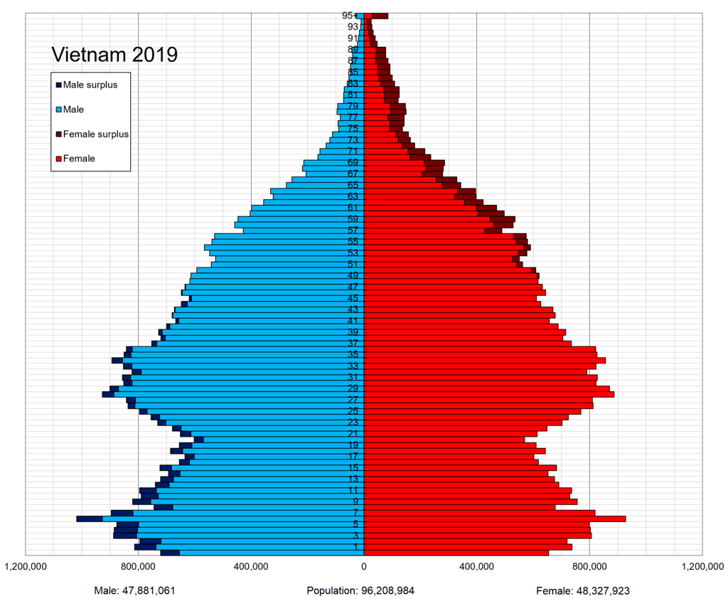
For example, this population pyramid for Vietnam has a lot of potential for analysis.
Why is there a surplus of women from the age of 60 onward? This might be the result of Vietnamese men dying in the Vietnam war. An 18-year-old man killed in 1975 at the end of the war would have been 62 in 2019, and any older men would have been of age to fight during the rest of the war.
Why is there a male surplus in younger Vietnamese people? Why are there sudden changes in the width of the younger bars? These effects may be the result of Vietnam’s family planning policy, which mandates that each family have only one or two children. In China, their one-child policy ultimately favored the births of male children.